Our guide to cohesion for Gap’s typographic identity.
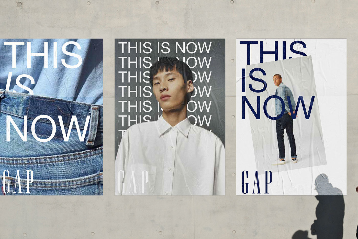
Campaign treatments.
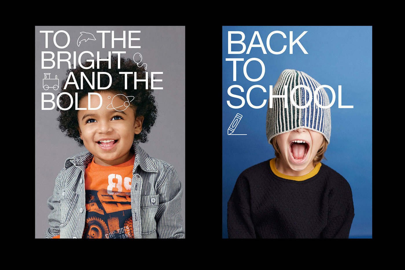
Gap Kids Sub-branding.
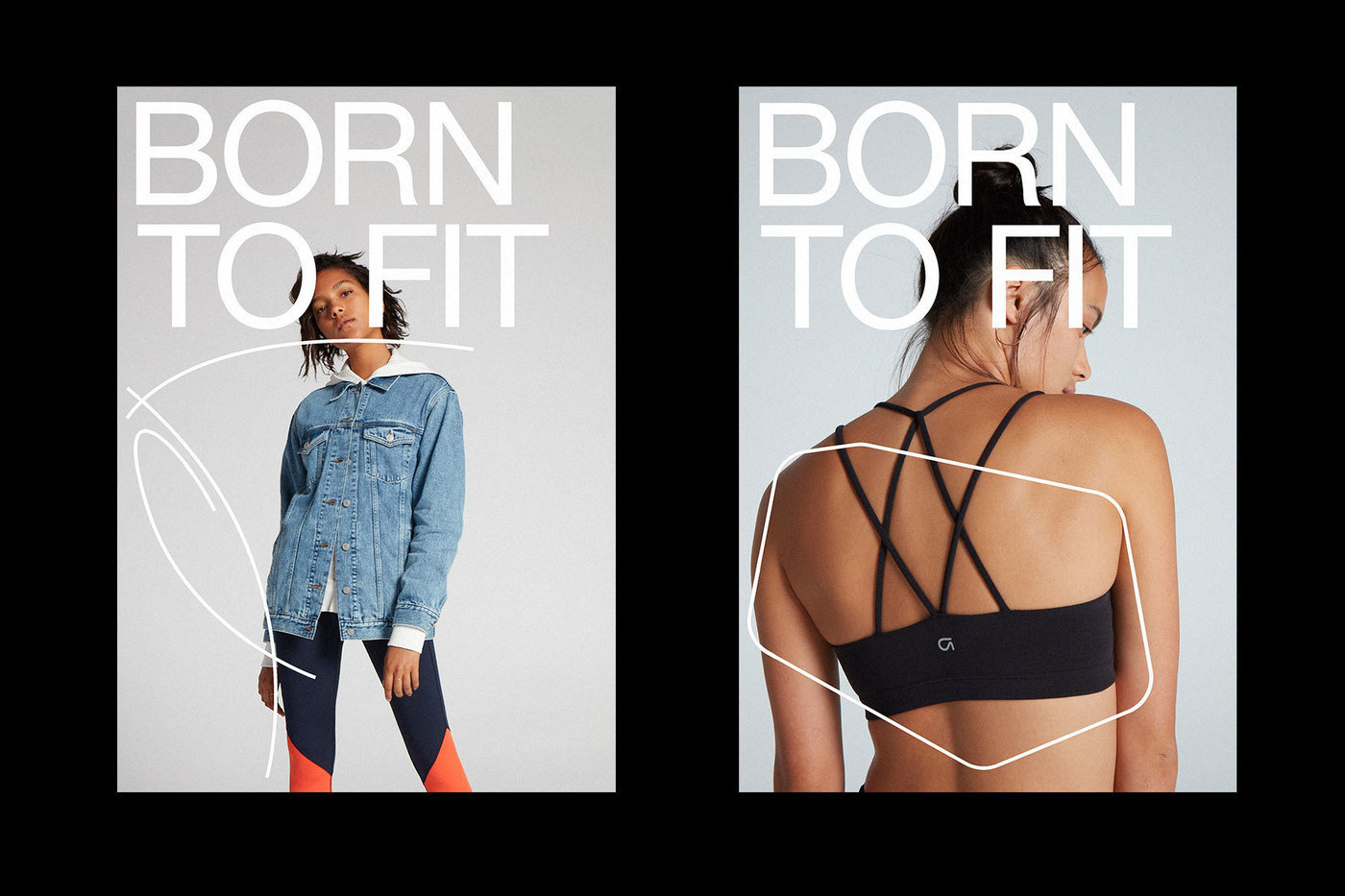
Gap Fit Sub-branding.
Animation techniques for email and social media.
Gap Kids Summer Campaign.
Wax Studios partnered with Gap to radically re-invent their approach to typography, bringing cohesion and unification to all moments of communication throughout their retail and digital experiences. The approach enacts the far-reaching power of typography and design to forward organizational change, unifying internal and external communication processes. While calling back to Gap’s long-standing relationship with Helvetica, the new system allows for broad strokes of distinction and playfulness for each new design.