Into logo 1400 xxx q85
Into timestamp 1400 xxx q85

intō centers around a single moment as a guiding principle, connecting consciousness to the present.

Arrow slideshow previous
Arrow slideshow next

We worked with foundry Bold Decisions to create a custom monospace cut of their typeface Lars for intō.

We worked with foundry Bold Decisions to create a custom monospace cut of their typeface Lars for intō.

Arrow slideshow previous
Arrow slideshow next

intō mono works with the alternate typeface gc16, also by Bold Decisions, to create a tension between solidity and fleeting beauty.

intō mono works with the alternate typeface gc16, also by Bold Decisions, to create a tension between solidity and fleeting beauty.

Into tube marcelo 1400 xxx q85

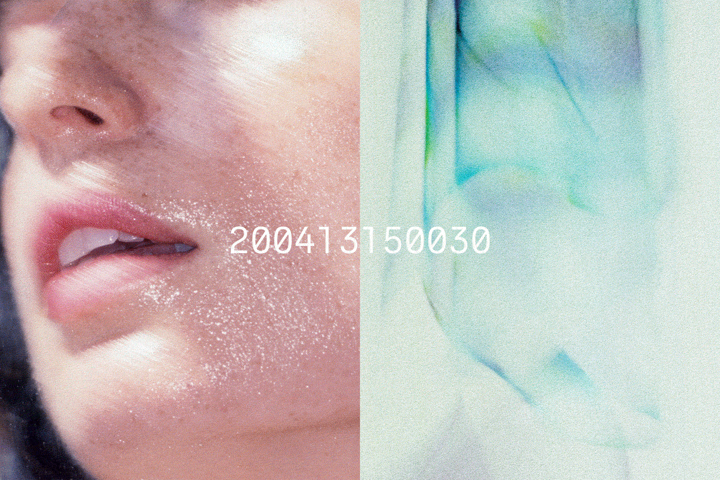
'wet' is intō's first product line, and lip moisturizer their first product.

Arrow slideshow previous
Arrow slideshow next

Each product is engraved with the moment it appears online, and a limited edition of 100 have special drop times at specific intervals.

The minimal packaging focuses on materiality and the experience of opening and using the product.

Arrow slideshow previous
Arrow slideshow next

intō wet standard edition.

Arrow slideshow previous
Arrow slideshow next

Product and brand photography by Marcelo Gomes.

Product and brand photography by Marcelo Gomes.

Product and brand photography by Marcelo Gomes.

Product and brand photography by Marcelo Gomes.

Product and brand photography by Marcelo Gomes.

Product and brand photography by Marcelo Gomes.

Arrow slideshow previous
Arrow slideshow next

A timestamp of the present is always running on the homepage of the website.

Limited edition product page.

Standard edition product page.

intō — identity, packaging, websiteArrowClose

Last year, two young Japanese entrepeneurs came to our studio with the idea of making an “anti-capitalist” conceptual brand called intō.

Wax Studios partnered with intō to develop the product concept for their line and first offering, lip moisturizer. Each container is inscribed with a specific timestamp, making the item not only a useful object,  but also a concept that reminds consumers of the importance of time.

In addition to designing the logo and custom typographic system, we also art directed all imagery, designed and produced packaging solutions and e-comm website for the brand.

Photography: Marcelo Gomes
Custom Typeface: Bold Decisions
Website Development: Mitchell Barton

ProfileClientsWax RadioWAX MagazineContact
The founders of Wax Studios have decided to move on and pursue new projects individually. If you’d like to get in touch please contact Dave Yun (dave@newinfo.studio, newinfo.studio) or Zak Klauck (z@zak.llc).

Click to continue on to the Wax Studios archive.