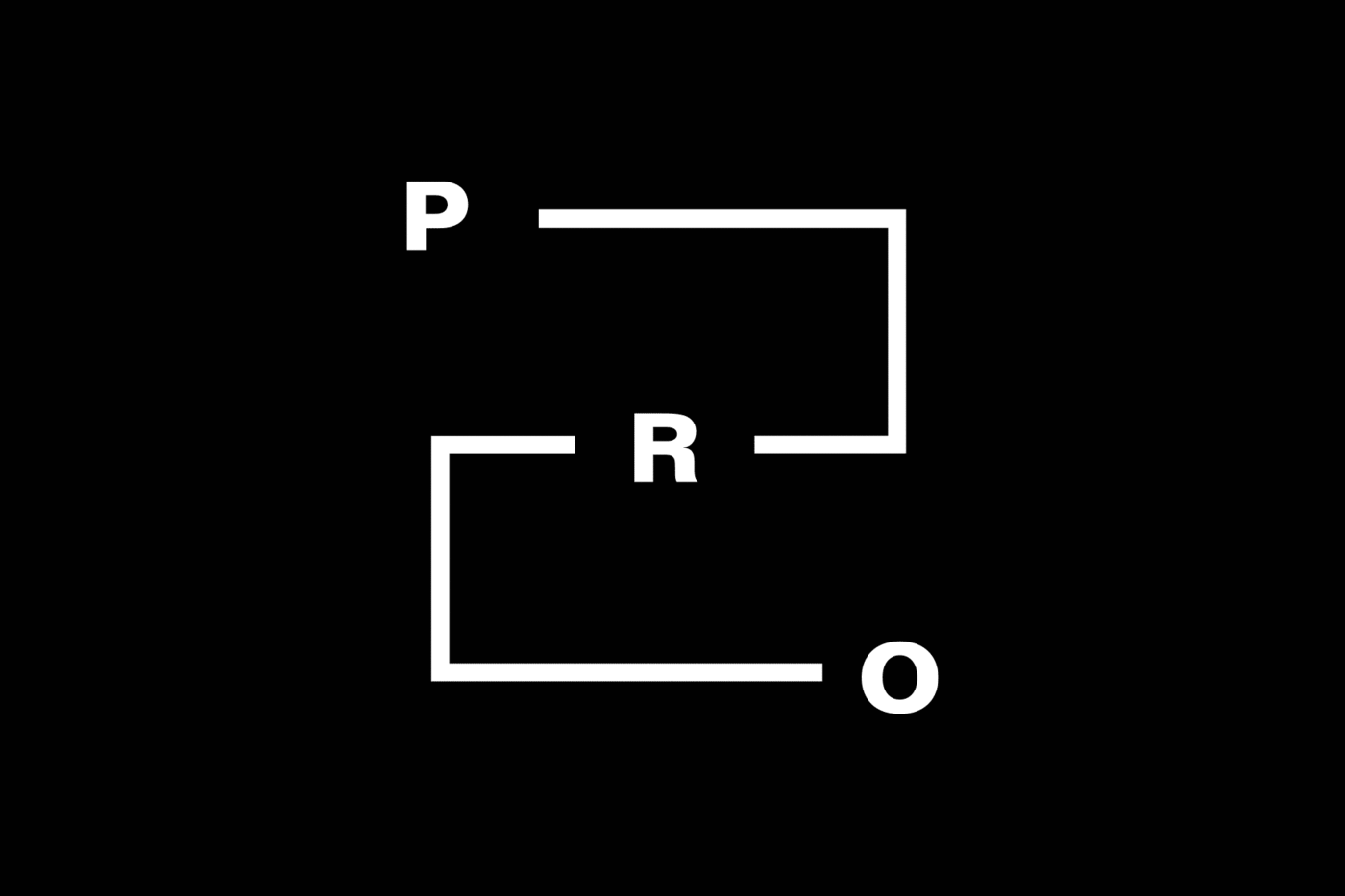
A linear grid system provides endless iterations of the P.R.O. logo.
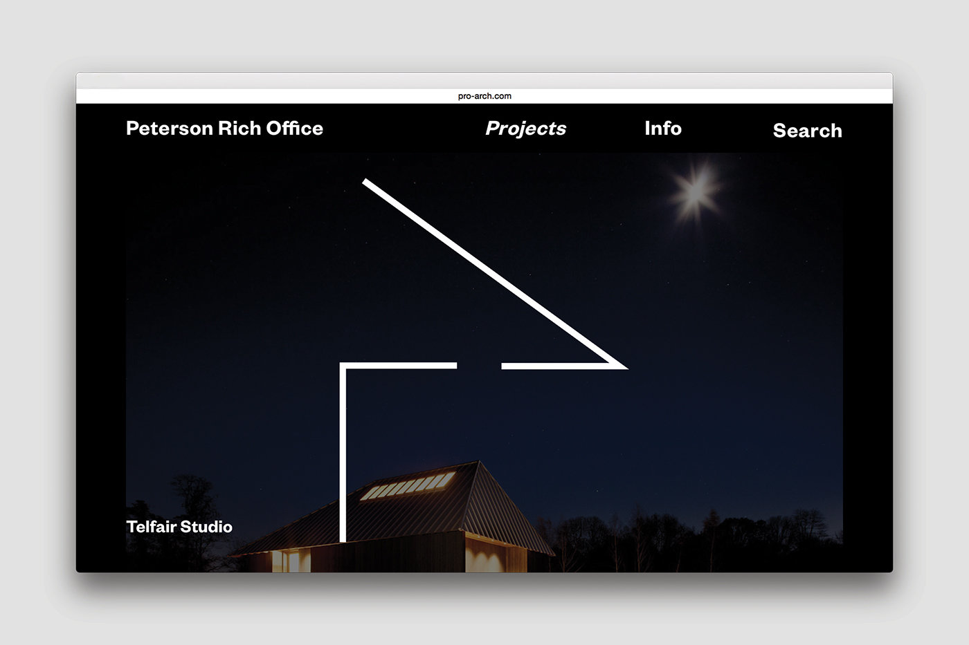
Project-specific line drawings extend the graphic identity.
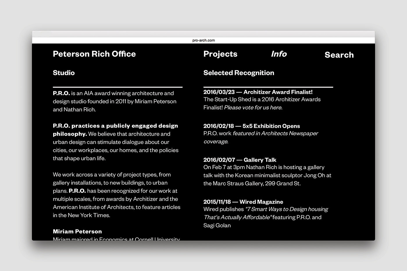
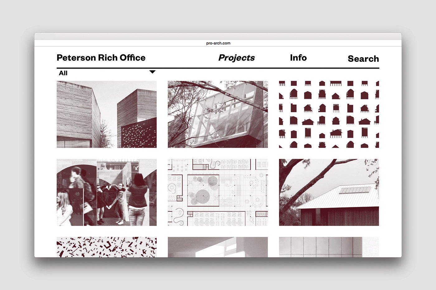
Peterson Rich Office (P.R.O.) is a growing architecture studio based in Brooklyn, practicing a “publicly engaged design philosophy.” Their designs traverse scales from urban life to homes, and their aesthetic approaches vary based on concept and program.
Wax Studios designed a dynamic identity that evades simplification or completion to reflect the mutability of P.R.O.’s conceptual approach. The dynamic line drawings are further carried out into the identity through abstract representations of each project, employed on the website and presentation materials.